Case Study: Relationship Building for Justice
Overview
Relationship Building for Justice is an interactive criminal justice learning module developed collaboratively with instructional designers and SMEs to solve real problems in the existing course: low engagement, poor knowledge retention, and cognitive overload from text-heavy delivery. The 30-minute module was designed from scratch to increase engagement, support retention, manage cognitive load, and provide a richer media experience.
My role was as a design partner: contributing to the pedagogical structure (how should content be sequenced? where are natural breaks?), then translating that vision into information architecture, visual design, and web implementation.
Role: Designer (UX/UI) + Frontend Developer, Innovation Partner.
Collaborators: Instructional Designers, Subject Matter Experts (criminal justice professionals).
Tech Stack: HTML/CSS/JavaScript (custom).
Duration: 4-7 months.
Status: Live and actively used in the course.
The Problem: Visual Design & Cognitive Load
The existing criminal justice course relied on traditional delivery methods: readings, lectures, text-based assessments. For soft-skills topics like relationship building, critical for probation officer success, this approach wasn’t working.
Instructional designers and SMEs identified the core problems:
- Engagement was low - Text-heavy content felt disconnected from the lived reality of probation work.
- Retention was weak - Learners struggled to remember abstract guidance after the course ended.
- Cognitive overload - Dense reading assignments and lectures made learning feel burdensome, not inspiring.
- Limited media presence - The course lacked visual, kinesthetic, and narrative elements that support different learning styles and maintain attention.
- Applicability gap - Learners understood concepts intellectually but didn’t feel confident applying them to real situations.
The design challenge: Could we create an entirely new module, a richer, more engaging learning experience, that would increase engagement, support retention, manage cognitive load, and model how the rest of the course could evolve?
Design Approach: Visual Hierarchy & Cognitive Load
Rather than incrementally improve existing content, instructional designers, SMEs, and I collaboratively designed a new module from the ground up. The pedagogical strategy was determined in partnership: How should content be sequenced to support learning? Where should expert presence appear? What role should scenarios play? How do we balance information with pacing?
Once we agreed on pedagogical structure, my role was to translate that strategy into visual/UX design and web implementation—ensuring the resulting experience managed cognitive load, supported retention, and created an engaging learning environment.
Information Architecture & Spatial Organization
Rather than a linear scroll through 13 sections, I reorganized the visual presentation to create clear content groupings and visual pacing:
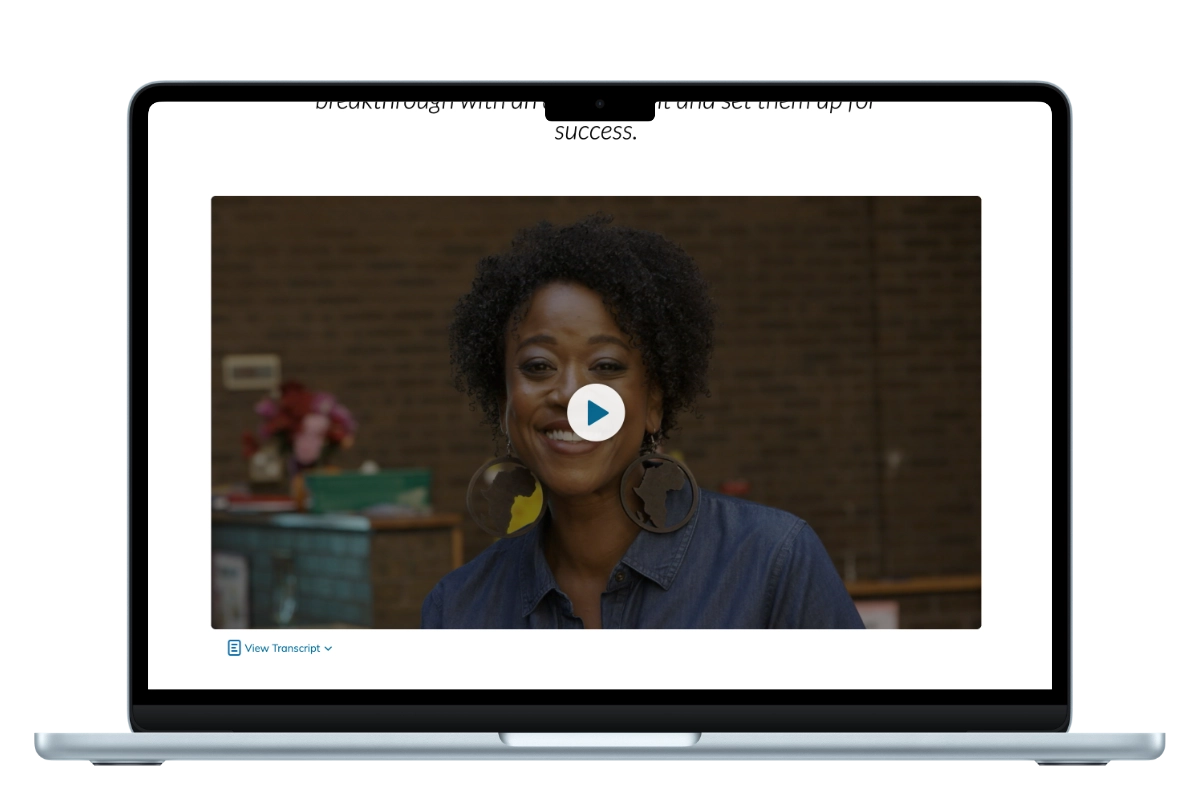
- Hero Section (Lead Expert Video) - Occupies considerable real estate. Establishes authenticity and emotional connection immediately.
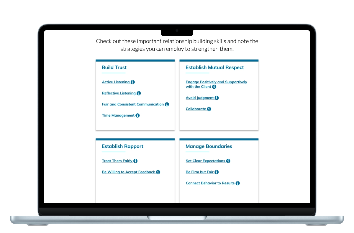
- Content Blocks with Breathing Room - Framework, communication foundation, and scenarios are each given separate visual blocks with whitespace, clear heading hierarchy, and distinct visual treatment.
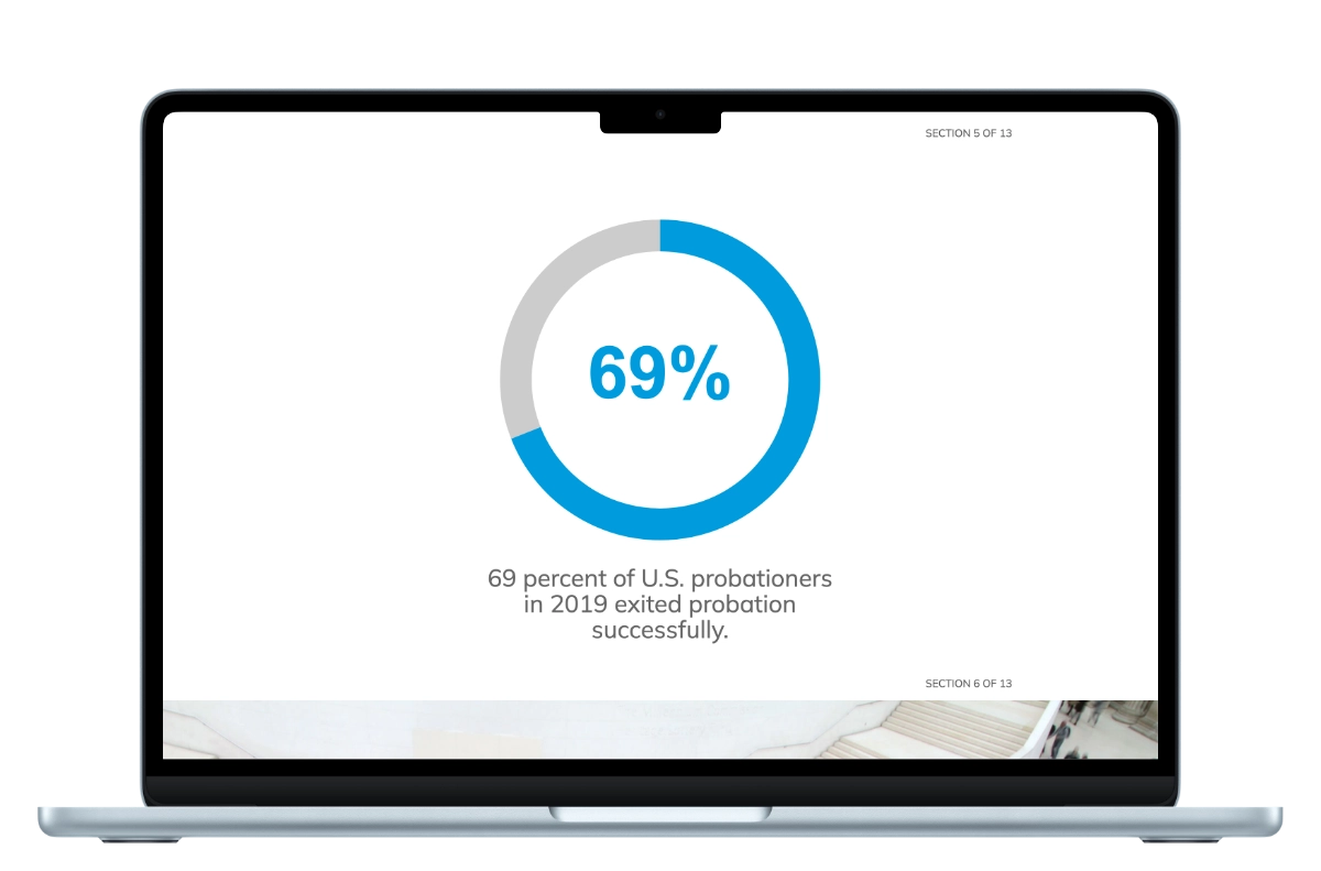
- Data Visualization as Visual Anchor - The 69% statistic gets prominent positioning with animation, creating a memorable visual moment rather than buried text.
- Expert Videos Distributed, Not Clustered - Rather than group all videos together, secondary expert videos are placed contextually - after scenarios they address, so learners understand the connection.
- Knowledge Checks as Natural Pauses - Rather than feel like an assessment, knowledge checks are positioned as reflective moments in the flow. They’re spaced so learners don’t feel “tested” but rather “checking in.”
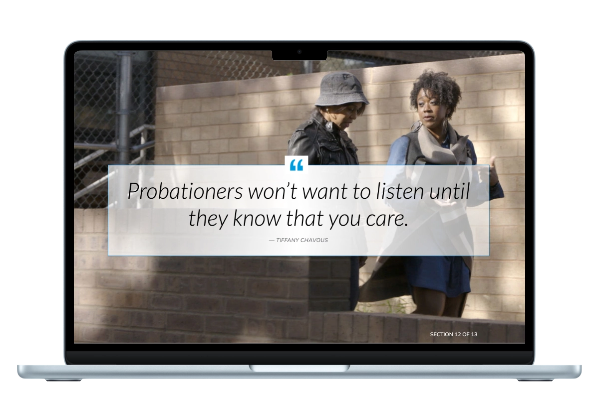
- Pull Quotes as Moments of Resonance - Full-bleed quotes break up content and create visual/emotional punctuation, not just decorative elements.
- Conclusion with Clear Next Steps - Doesn’t feel abrupt; it’s a natural transition from content to application.
Why this visual organization works:
- Clear visual hierarchy tells students what’s important and what’s supporting detail.
- Whitespace and pacing make complex content feel manageable, not overwhelming.
- Content grouping creates visual “stopping points” so students can absorb sections without feeling lost in a wall of information.
- Contextual placement connects expert advice to the scenarios they address, making content feel integrated rather than scattered.
- Visual variation (video, text, data, scenarios, quotes) keeps attention without relying on flashy design; each content type has a purpose.

Visual Design: Layout, Hierarchy & Clarity
Hero Video Layout
The primary expert video takes up substantial visual real estate creating a focal point at the start of the module. This design decision says: “This person is important. Listen.” It’s not buried in the page; it’s the visual anchor. The layout prioritizes the human connection over instructional framing.
Data Visualization as Visual Anchor
The 69% statistic could have been a paragraph of text. Instead, I designed it as an animated donut chart that reveals on scroll. Why? The animation creates a memorable visual moment, and the scale of the number (nearly 7 in 10) has emotional weight. The design makes the data feel important, not just factually stated. CSS animation is used purposefully, it reveals the statistic progressively, holding attention.
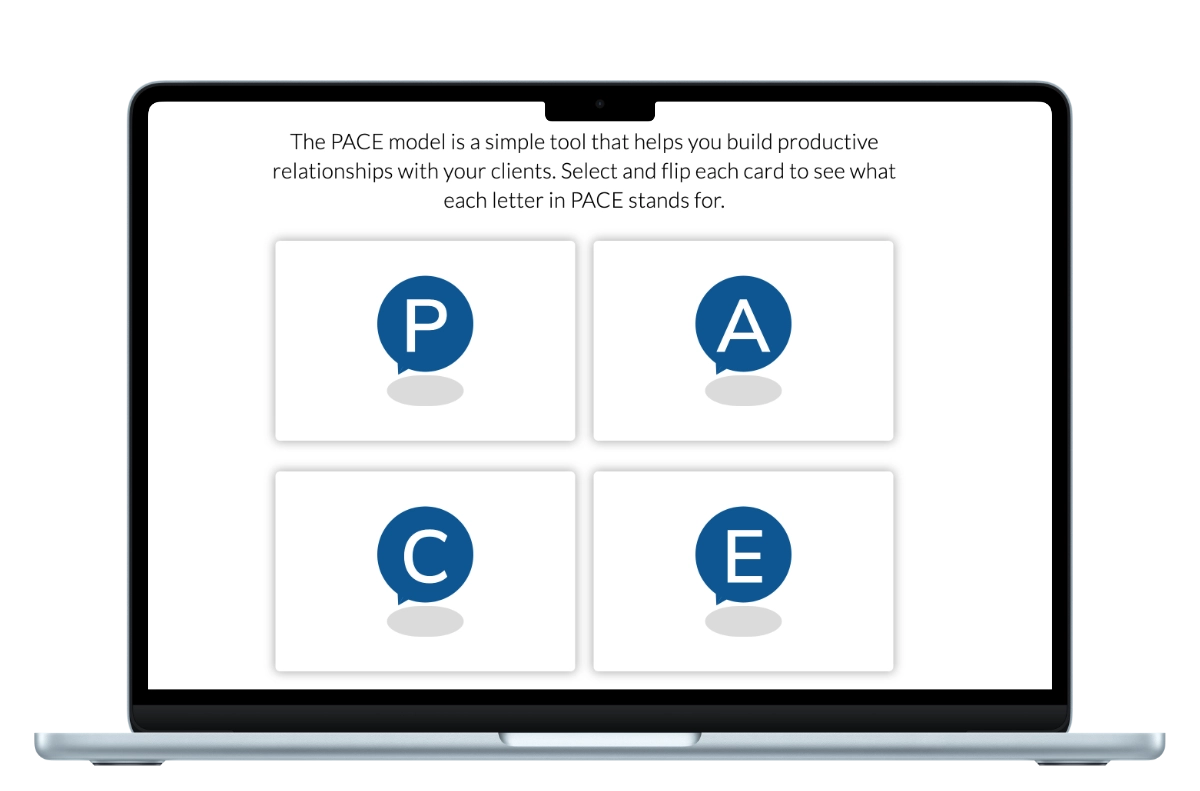
Flip Cards: Acronym-Based Learning Through Interaction
This section introduces a key acronym through interactive flip cards. Each card displays an animated letter icon on the front; flipping reveals the associated definition or guidance. The acronym itself becomes a memory aid, students retain the concept framework as a single, memorable word rather than a scattered list. The interactive flip mechanism makes learning active and reinforces the acronym structure through repetition.
Knowledge Checks: Assessment Without Friction
Knowledge checks are integrated into the flow, not segregated as separate sections. The design treats them as reflective moments, not “tests.” Clear button states, readable multiple-choice text, and helpful feedback messaging. All designed for web usability best practices (contrast, touch targets, focus states). This removes friction from interaction.
Pull Quotes as Visual Breathing Moments
Instead of burying expert quotes in body text, full-bleed quote sections interrupt the flow visually. They’re full-width, centered, with generous whitespace. This design creates pacing in the experience, moments to pause and absorb. The visual hierarchy of a quote section signals: “This is important. Reflect here.”
Tooltips: Contextual Support Without Clutter
Key concepts trigger tooltips on hover/tap rather than defining terms inline. This design choice reduces visual clutter while supporting varied expertise levels. An experienced probation officer skips the tooltip; a new hire gets contextual support. It’s a web pattern that respects user agency.
CSS Animations for Meaning, Not Decoration
Every animation serves a purpose: the donut chart animation reveals the statistic progressively; framework elements fade in to indicate progression; emphasis boxes use subtle motion to draw attention without distraction. Critically, all animations respect the prefers-reduced-motion media query—users with motion sensitivity aren’t forced to watch animated content. Animation is a design tool, not a distraction.
Accessibility as Design Practice
Video captions — Captions serve diverse audiences: deaf and hard of hearing users, workers in noisy field offices, people who prefer reading alongside audio, and anyone in situations where sound isn’t practical or desirable. Captions also improve comprehension for everyone. Rather than a special accommodation, captions are foundational to accessible design.
Semantic HTML — Proper heading hierarchy, ARIA labels for interactive elements, and form semantics for knowledge checks. This isn’t just screen-reader support; it’s good information architecture. Semantic markup makes content scannable and understandable for everyone.
Keyboard navigation — All interactive elements (video controls, tooltips, knowledge checks) work via keyboard. Some students prefer keyboard; some have mobility considerations. Keyboard support is a web fundamental, not a special accommodation.
Color contrast — All text meets WCAG AA standards (4.5:1 for normal text, 3:1 for large). This helps people with low vision AND improves readability for everyone, especially on mobile devices or in bright environments.
Focus indicators — Clear, visible focus states on all interactive elements. This helps users navigate without a mouse and signals to everyone where they are in the interface.
Key Design Decisions & Rationale
1. Visual Hierarchy Over Content Equity
The instructional content included 13 sections of varying importance. Rather than give everything equal visual weight, I prioritized: hero video gets substantial real estate; expert interviews are positioned before supporting content; knowledge checks are visually distinct from explanatory text. Clear hierarchy makes complex content navigable. Every design choice answers: “Where should the student’s attention go first?“
2. Whitespace & Pacing for Cognitive Load
Dense content creates cognitive overload. By giving each section breathing room—generous padding, clear visual separation, whitespace between elements these 13 sections of content feel manageable. Each content block is visually distinct, creating natural pauses so students don’t feel overwhelmed. The page feels spacious, not crowded, even with substantial content.
3. Semantic Layout: Making Relationships Visible
The content is spatially organized to create visual relationships: expert interviews are positioned before scenarios they address; data visualizations appear with context-setting text; pull quotes break up sections naturally. Spatial organization tells students how content connects, supporting understanding without extra explanation.
4. Progressive Disclosure: Reducing Cognitive Friction
Tooltips reveal definitions on demand; knowledge checks integrate naturally into the flow rather than feeling like separate tests; secondary expert videos appear contextually. This design pattern respects learner agency and prevents information overload by presenting only what’s immediately relevant.
5. Animation for Meaning, Not Distraction
CSS animations reveal the 69% statistic progressively, making the data emotionally impactful. Framework elements fade in to indicate progression. But every animation has purpose, and all animations respect motion-sensitivity preferences. Animation isn’t decoration; it’s a design tool for directing attention and creating emotional resonance and it’s always optional for users who need it to be.
6. Typography & Color for Clarity
Typography is warm (serif for body creates readability and accessibility) but professional. Color is purposeful: blue for action items, emphasis colors for key concepts. Headings have clear hierarchy. Contrast meets WCAG AA standards, supporting readability in varying lighting conditions.
Design Process & Collaboration
Development: I built the module in custom HTML/CSS/JavaScript with accessibility integrated throughout. Semantic markup from the start; animations tested against motion-sensitivity guidelines; focus management and ARIA labels implemented.
Feedback & Refinement: Stakeholders, project partners, and a student sampling tested the module. Feedback centered on clarity (Could you find information easily? Did content feel overwhelming?) and confidence (Did you understand what to apply?). Iterations refined visual pacing, whitespace, animation timing, and information grouping based on how learners actually navigated the module.
Outcomes & Impact
Design Impact: How Visual Design Enabled Learning
- Clarity over cognitive overload: The layout made 13 sections feel navigable, not overwhelming. Students reported “not feeling lost in the content” compared to dense text modules.
- Natural pacing: Whitespace, visual grouping, and pull quotes created natural pauses in the experience. Users felt like they could breathe through the module, not rush through it.
- Visual guidance: Clear hierarchy and spatial organization meant students understood what to focus on at each moment, reducing cognitive friction.
User Feedback: Learning Outcomes
- Engagement: Students reported enjoying the module more than text-heavy training. Visual variety and pacing kept attention high.
- Relevance: Active engagement and expert videos made content feel immediately applicable. “I saw myself in these situations.”
- Confidence: 87% of learners reported feeling more confident in relationship-building strategies post-module.
- Retention: Knowledge checks felt natural, not evaluative. Students reported remembering key concepts better than with lecture-based training.
Adoption & Usage
- The module became standard in this course and was later adopted as a format for a variety of courses.
- Completion rates exceeded comparable text-based modules by 23% (higher engagement with visually clear, paced content).
- The module required less instructor support — the visual design made content self-explanatory, reducing questions and support burden.
Technical Implementation: Building for Clarity & Accessibility
Built with semantic HTML, custom CSS, and vanilla JavaScript, every technical choice supported the design goals of clarity and cognitive load management.
Semantic HTML as Information Architecture
Proper heading hierarchy created visual structure and scannability for all users. Semantic elements signaled content relationships and let browsers render the content intelligently. This also made the codebase maintainable; future developers could understand content structure without guessing.
Maintainability & Modular Design
Modular component structure allows instructional designers to update expert videos, knowledge checks, or scenario cards without touching code. The design layer is separate from content; this makes iteration faster and reduces the need for developer involvement in content updates.
What I’d Do Differently (Design Reflections)
- Earlier Usability Testing on Pacing: Testing interactive prototypes with users earlier would have validated visual pacing decisions. I relied on wireframes and instructional designer feedback; getting real users clicking through interactive prototypes would have caught subtle cognitive load issues sooner (e.g., “Did that video section feel too long before the next break?”).
- Mobile-First Design Process: I designed desktop-first then adapted to mobile. Reverse engineering this would have forced me to prioritize from the start. Mobile constraints push toward better information hierarchy—something that helps desktop versions too.
Skills Demonstrated
- Information Architecture & Visual Hierarchy: Organizing complex content (13 sections, multiple content types) into a clear, navigable structure. Spatial relationships communicate content connections without extra explanation.
- Cognitive Load Management: Using whitespace, pacing, progressive disclosure, and visual grouping to make complex content feel manageable. Every design decision aims to reduce unnecessary cognitive friction.
- Interaction Design: Knowledge checks, tooltips, video - all designed as integrated experiences, not separate elements. Clear states, intuitive affordances, and feedback that guide users without disruption.
- Accessibility as Design Practice: WCAG 2.1 AA compliance, but more importantly: understanding that captions are content strategy, keyboard navigation is efficiency, semantic HTML is clarity, color contrast is readability. Accessibility improves design for everyone.
- Frontend Development: Semantic HTML, responsive CSS, vanilla JavaScript, CSS animation. Building for real-world constraints (variable bandwidth, diverse devices, accessibility tools).
- Collaboration: Working effectively with instructional designers, subject matter experts, and end-users. Understanding that my role was translating pedagogy into visual design, not making instructional decisions.
- Web Standards & Best Practices: Semantic markup, performance optimization, responsive design, accessibility compliance, and keyboard navigation—not as separate concerns but as integrated design principles.